What is aesthetics and attributes in ggplot's world?
ggplot2 is a powerful data visualization tool of R. Make quick visualizations to explore or share your insights.
Learning how aesthetics and attributes are defined in ggplot will give you an edge to develop your skills quickly.
ggplot2 tips: distinction between aesthetics and attributes
Aesthetics are defined inside aes() in ggplot syntax and attributes are outside the aes().
e.g. ggplot(data, aes(x, y, color=var1) + geom_point(size=6)
We typically understand aesthetics as how something looks, color, size etc.
But in ggplot’s world how things look is just an attribute.
I will create an imaginary data frame to apply those concepts.
library(ggplot2)
points <- 500
# Defining the Golden Angle
angle <- pi*(3-sqrt(5))
t <- (1:points) * angle
x <- sin(t/2)
y <-cos(t/2)
z <- rep(c(1,2,3,4,5,6,7,8,9,10), times=50)
w <- rep(c(1,2), times=250)
df <- data.frame(t, x, y, z, w)
# Have a look at the data
head(df)
## t x y z w
## 1 2.399963 0.9320324 0.36237489 1 1
## 2 4.799926 0.6754903 -0.73736888 2 2
## 3 7.199890 -0.4424710 -0.89678282 3 1
## 4 9.599853 -0.9961710 0.08742572 4 2
## 5 11.999816 -0.2795038 0.96014460 5 1
## 6 14.399779 0.7936008 0.60843886 6 2The dataframe we created has 3 numeric (t, x, y) variables and 2 discrete variables (z, w). With ggplot2 I can map any of the variables on my plot by defining them inside the aes().
# Make a scatter plot of points of a spiral
p <- ggplot(df, aes(x*t, y*t))
p + geom_point()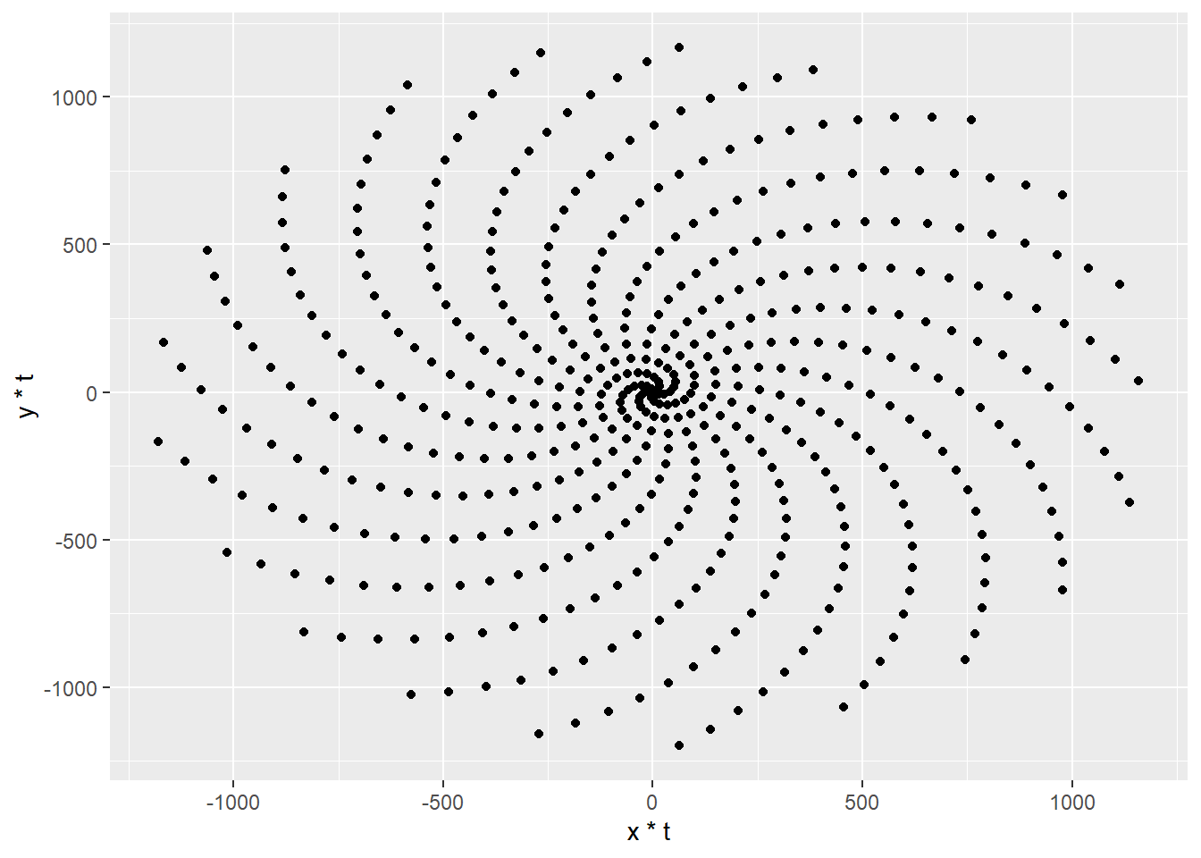
Example use of an aesthetics
By defining col=factor(z) inside aes(), I can map z to colors. So now the graph shows x, y and also values z.
# Make a scatter plot of points in a spiral
p <- ggplot(df, aes(x*t, y*t, col=factor(z)))
p + geom_point()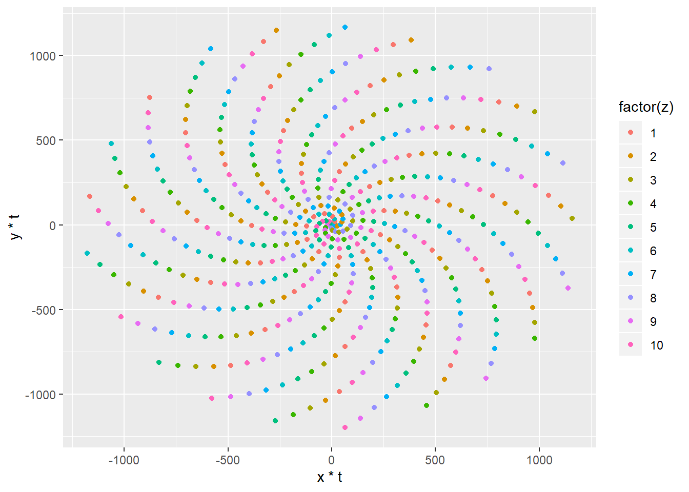
Each different color now represents different values of z.
Example use of an attribute
Attribute is how somethings looks. e.g. you can the points bigger by defining size=4. But it does not give any extra information about data.
# Make a scatter plot of points in a spiral
p <- ggplot(df, aes(x*t, y*t, col=factor(z)))
p + geom_point(size = 4)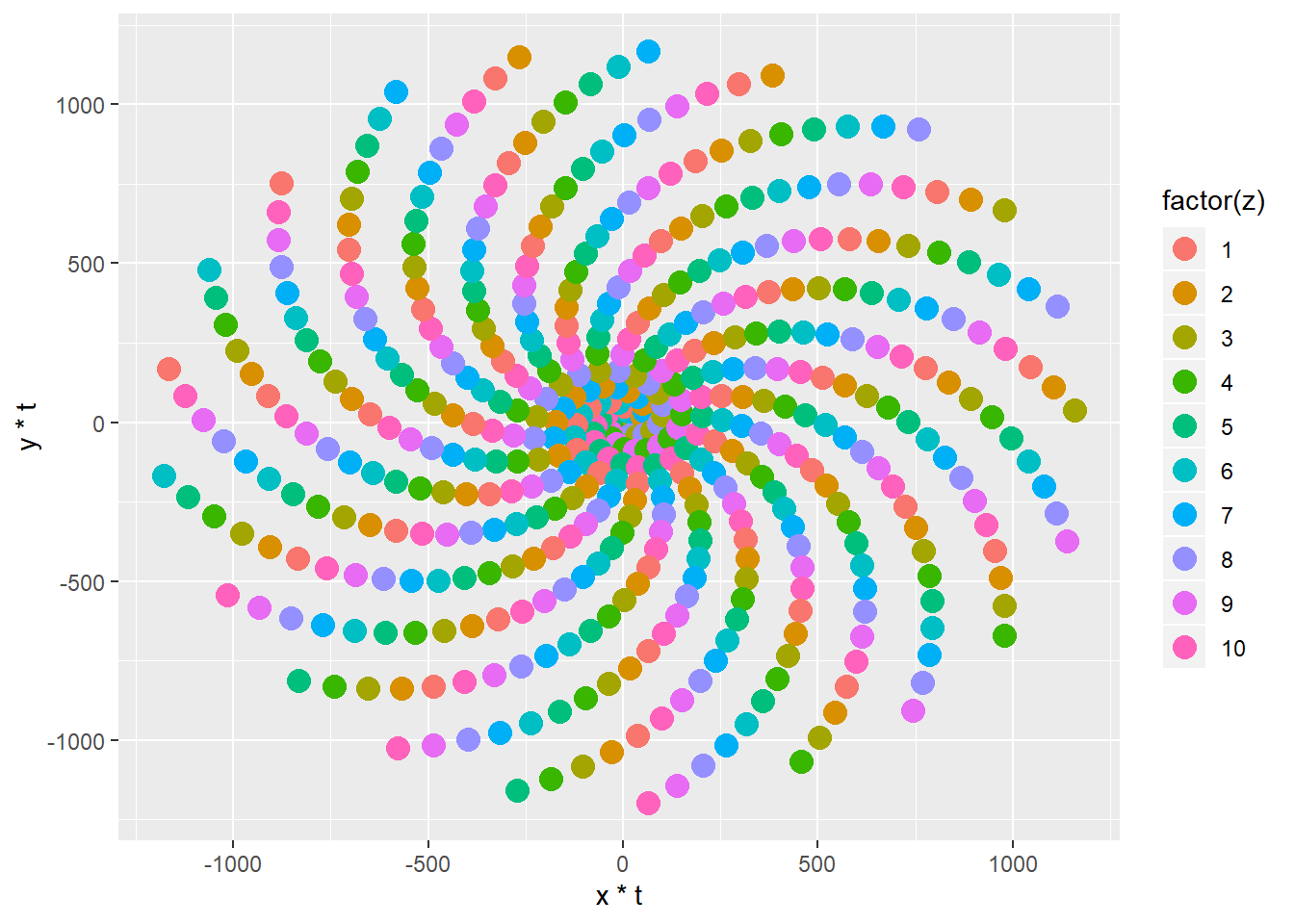
Use shape as an attribute
Same goes here. I am changing how something looks like. The data point shape change to 24 which defines a empty triangle. But nothing is mapped onto it. It is just an attribute.
# Make a scatter plot of points in a spiral
p <- ggplot(df, aes(x*t, y*t, color=factor(z)))
p + geom_point(shape=24, size=4)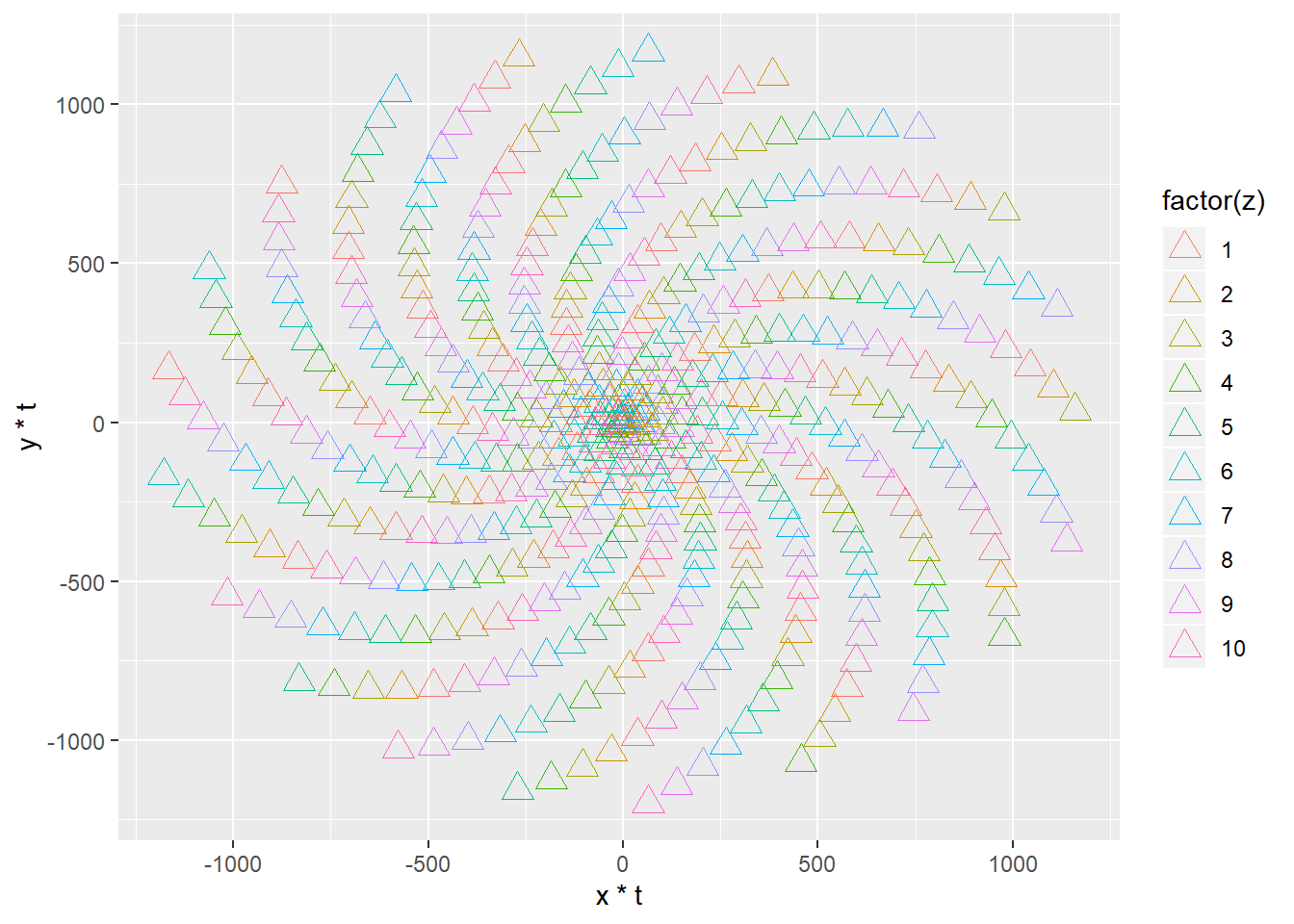 Here, xt, yt and factor(z) is mapped on to our graph.
Using shape as an aesthetics
By defining shape and color inside aes() I can map w and z to my plot as well.
points <- 500
# Defining the Golden Angle
angle <- pi*(3-sqrt(5))
t <- (1:points) * angle
x <- sin(t)
y <-cos(t)
z <- rep(c(1,2,3,4,5,6,7,8,9,10), times=50)
w <- rep(c(1,2), times=250)
df <- data.frame(t, x, y, z, w)

p <- ggplot(df, aes(x*t, y*t, shape=factor(w), color=factor(z)))
p + geom_point(size=3)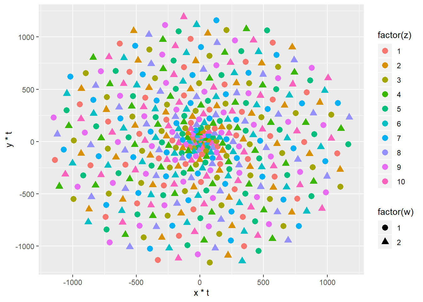
Spirals look nice and we got some basics of ggplot. Now let’s use it to create a pattern designer, with Shiny. Many patterns in Nature can be explained by mathematical terms, Shapes of sunflowers, dandelions or snowflakes etc.
I will tell the rest of the story in the next update. Now you can play with the app to create your patterns!
Until next time!
Serdar
Serdar Korur
Data Scientist and PhD in Molecular Biology
Serdar is a Data Scientist and PhD in Cell Biology