Add custom summary statistics in ggplot2
It is hard to understand your data by looking at the numbers on a csv file. You need to plot it. And adding statistics to your plots will make it more informative.
To evaluate data, we typically use mean and median to define its central tendency and range, quartiles, variance and standard deviation to define how spread it is.
Mean and standard deviation is a good representation of the data if we don’t have extreme values that result in a skewed distribution. But, if we have outliers they might misguide us. In those conditions, median and quartiles will serve us better.
Median is the central point which divides the data into half. Quartiles are used to describe the spread of the data. The word comes from the Medieval Latin “quartilis” which means fourth and quartiles break the data into four equal parts.
For this reason, quartiles are often used along with the median as the best measures of spread.
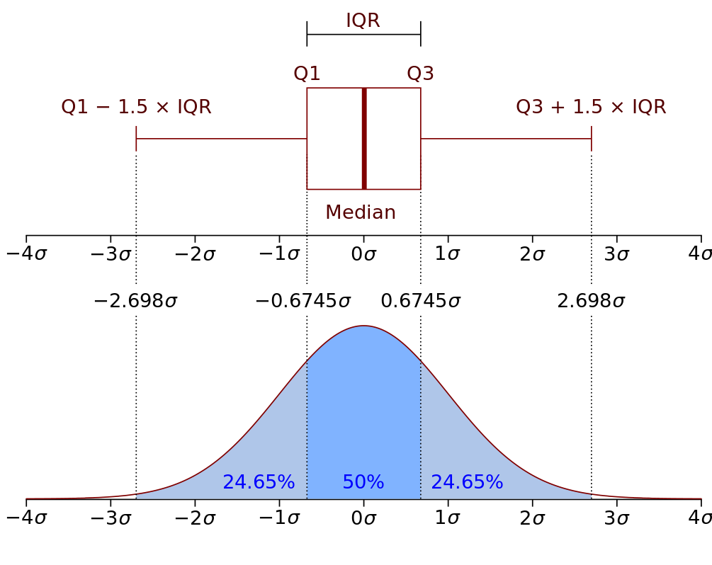
They are often expressed as an Interquartile range (IQR), which is the interval between first and third quartiles and represents 50% of the data points.
For example, you measured height of adults in a population, with Interquartile range you can describe a discrete interval centered around the median including 50% of the measurements.
Here is a representative graph. [source:wikipedia]
How to include statistics in ggplot2
Stats make it easier to grasp the data. And different statistics are suited for different data types. For example, you may want to show a 95% confidence interval? or mean? median? or any other statistics which captures the details best for your data.
So let’s go through on an example data to understand how statistics can be overlayed in ggplot2. The data is about the effects of two Herbicides (glyphosate & bentazone) on the yield of white mustard (Sinapis alba) seeds.
First, import ggplot2 package and read in the data.
library(ggplot2)
path <- "C:/Users/serda/Downloads/S.alba.csv"
data <- read.csv(path)
str(data)
## 'data.frame': 68 obs. of 4 variables:
## $ X : int 1 2 3 4 5 6 7 8 9 10 ...
## $ Dose : int 0 0 0 0 0 0 0 0 10 10 ...
## $ Herbicide: Factor w/ 2 levels "Bentazone","Glyphosate": 2 2 2 2 2 2 2 2 2 2 ...
## $ DryMatter: num 4.7 4.6 4.1 4.4 3.2 3 3.8 3.9 3.8 3.8 ...These chemicals used at 8 different doses and the yield is measured. I will convert the dose variable as a factor.
data$Dose <- as.factor(data$Dose)
levels(data$Dose)
## [1] "0" "10" "20" "40" "80" "160" "320" "640"We can make an initial plot to visualize the data. We’ll plot the yield variable DryMatter against Dose of the Herbicides. We can assign col argument to map different chemical compounds to different colors.
# I will define a dodge and jitterdodge object to avoid overlapping data points
# or stats that we will overlay later
posn.d <- position_dodge(width=0.2)
posn.jd <- position_jitterdodge(jitter.width = 0.1, dodge.width=0.2)
p <- ggplot(data, aes(x=Dose, y=DryMatter, col=Herbicide, fill=Herbicide,
                      group=Herbicide ))
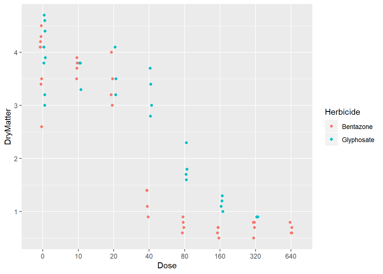
p + geom_point(position =posn.jd)
What we see here is that, at low doses both Herbicides led similar yields but starting from Dose 40 we see a drastic negative impact of Benzoate on yield.
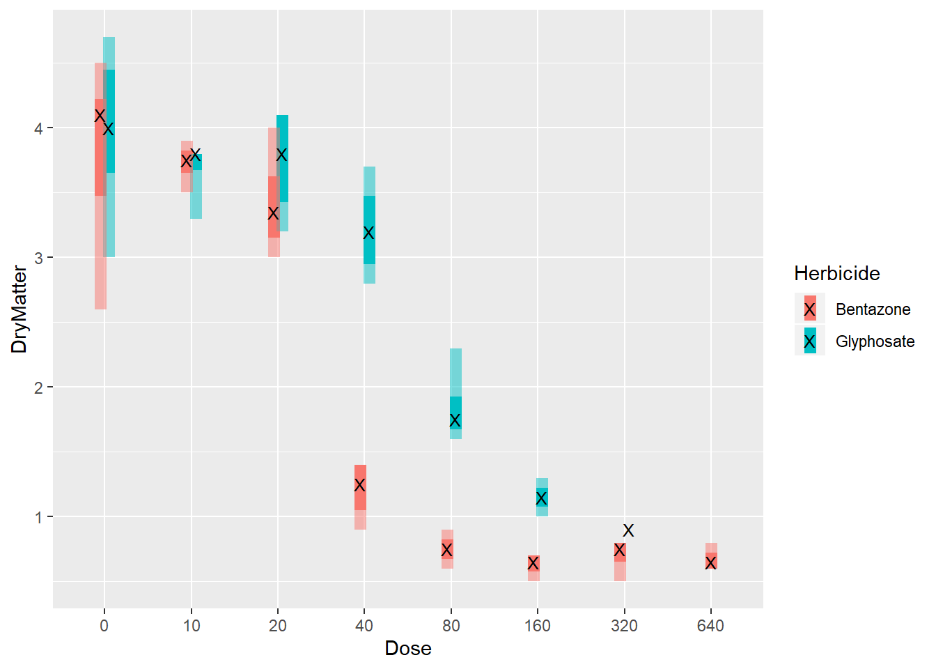
On top of that plot, I want to overlay the min, max and also median and Interquartile range for each set of yield measurements.
There are many default functions in ggplot2 which can be used directly such as mean_sdl(), mean_cl_normal() to add stats in stat_summary() layer. But, I will create custom functions here so that we can grasp better what is happening behind the scenes on ggplot2.
I will create one function to calculate the median and the interquartile range(IQR) 1-3, and another to calculate min(), max() values.
# Function for median and IQR

median_IQR <- function(x) {
  data.frame(y = median(x), # Median
             ymin = quantile(x)[2], # 1st quartile
             ymax = quantile(x)[4])  # 3rd quartile
}

# Function for min, max values
range <- function(x) {
  data.frame(ymin=min(x),
             ymax=max(x))
}
Let’s replot with the statistics we wanted to overlay. You can use two stat_summary() layers to add our stats. You can set the fun.data argument to the specific function defined above.
# Updated plot
p +
  stat_summary(geom = "linerange",
                 fun.data = median_IQR,
                 position = posn.d,
                 size=3) +
  stat_summary(geom = "linerange",
               fun.data = range,
               position = posn.d,
               size=3,
               alpha=0.5)+
  stat_summary(geom = "point",
               fun.y = "median",
               position = posn.d,
               size = 3,
               col = "black",
               shape = "X")
In contrast, to the first plot here we easily see where the median and IQR lays. We can make our comparisions easier. Starting from dose 20, we see that glyphosate clearly outperforms bentazone. Big separation between the IQRs are obvious at doses 40 and 80. At higher doses, differences in IQRs starts to disappear.
Conclusions
Ggplot2 is a flexible package and knowing its intricacies will help you level up your visuals. To understand your data and to convey the insights you want to point out, you can include your choice of custom functions in ggplot stat_summary() layer similarly as we did above or use the default functions.
The data we have here was small. With bigger data, it is more crucial to overlay summary statistics of interest for effective visuals.
Until next time!
Serdar