Cleaning and visualizing Five-year cancer survival statistics with ggplot2 and animation
Where are we standing on fight against cancer?
Five-year survival rates is a good indicator of improvement in cancer medicine.
I am using the article by Jemal et. al. published on the Journal of the National Cancer institute. You can find the original publication here: https://academic.oup.com/jnci/article/109/9/djx030/3092246
Final take home messages in this article were:
- Cancer death rates continue to decrease in the United States
- But progress is very limited in some cancers
What is needed?
- New strategies for prevention, early detection and treatment is crucial.
The authors made an extensive study to investigate changes in five year cancer survival rates between the years 1975-77 to 2006-12. I want to create data visualizations to have an overview on the progress we made so far and also compare different types of cancers.
You can access the data on my Github repository at https://github.com/korur/healthcareinformatics.
Setting up and loading in data
library(readxl)
library(tidyverse) # ggplot2, dplyr, tidyr, readr,
                   # purrr, tibble, stringr, forcat
library(ggdark)
library(animation)
library(waffle)

cancer <- read_excel("posts_data/cancersurvivalstatistics.xls", sheet = 3)
cancer
## # A tibble: 42 x 13
## Info `1975-1977...2` `2006-2012...3` `Absolute (%)..~ `Proportional (~
## <chr> <chr> <chr> <chr> <chr>
## 1 All ~ 50.29999999999~ 66.40000000000~ 16 31.899999999999~
## 2 (cas~ (50.1, 50.6) (66.2, 66.5) (15.7, 16.3) (31.1, 32.6)
## 3 Oral~ 52.5 67 14.4 27.399999999999~
## 4 <NA> (51.1, 54.0) (66.1, 67.9) (12.7, 16.1) (23.5, 31.4)
## 5 Esop~ 5 20.5 15.5 308.10000000000~
## 6 <NA> (4.0, 6.2) (19.4, 21.7) (13.9, 17.1) (217.6, 398.6)
## 7 Stom~ 15.19999999999~ 31.10000000000~ 15.9 104.7
## 8 <NA> (14.1, 16.3) (30.1, 32.2) (14.4, 17.4) (88.2, 121.1)
## 9 Colo~ 49.79999999999~ 66.20000000000~ 16.399999999999~ 32.899999999999~
## 10 <NA> (49.1, 50.6) (65.7, 66.7) (15.5, 17.3) (30.7, 35.1)
## # ... with 32 more rows, and 8 more variables: `1975-1977...6` <chr>,
## # `2006-2012...7` <chr>, `Absolute (%)...8` <chr>, `Proportional
## # (%)...9` <chr>, `1975-1977...10` <chr>, `2006-2012...11` <chr>,
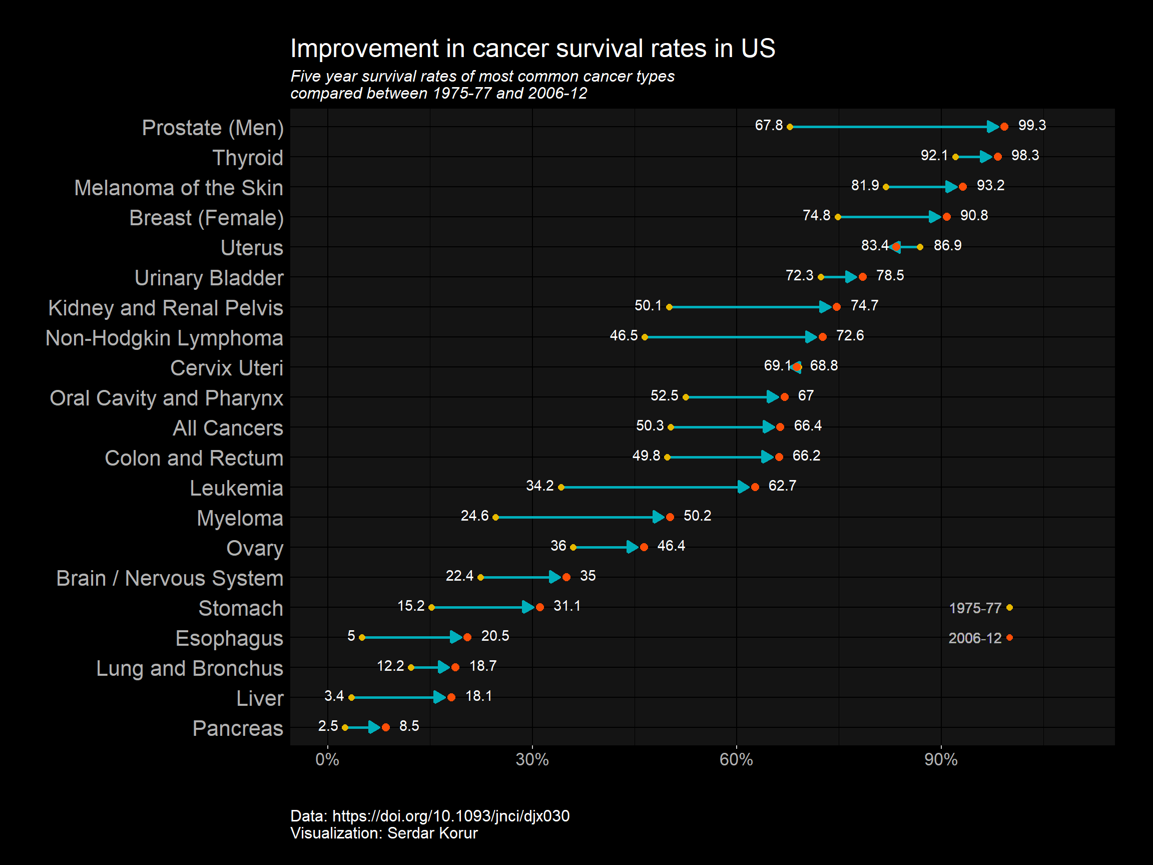
## # `Absolute (%)...12` <chr>, `Proportional (%)...13` <chr>I will use lolipop charts to plot the change in the survival rates. We need some data preparation first. You can see the NAs in the first row. These actually contain the confidence intervals for the survival rates. Since I will not use them I can use na.omit() function to remove them.
I will also change column names and some long cancer types for easier typing.
cancer <- na.omit(cancer)[-2, 1:5]
colnames(cancer) <- c("type", "Y1977", "Y2012", "Absolute", "Proportional")
cancer[,2:5] <- sapply(cancer[,2:5], as.numeric)
cancer$type[19] <- "Uterus"
cancer$type[16] <- "Prostate (Men)"
cancer$type[1] <- "All Cancers"
cancer$type[12] <- "Brain / Nervous System"
cancer$type[6] <- "Liver"
head(cancer)
## # A tibble: 6 x 5
## type Y1977 Y2012 Absolute Proportional
## <chr> <dbl> <dbl> <dbl> <dbl>
## 1 All Cancers 50.3 66.4 16 31.9
## 2 Oral Cavity and Pharynx 52.5 67 14.4 27.4
## 3 Esophagus 5 20.5 15.5 308.
## 4 Stomach 15.2 31.1 15.9 105.
## 5 Colon and Rectum 49.8 66.2 16.4 32.9
## 6 Liver 3.4 18.1 14.6 428.Most often I prefer data in tidy format which is:
- Each observation has its own row.
- Each variable has its own column.
For an example post where I tidied my data with gather() function.
In my data although two variables Y1977 and Y2012 are in two separate columns instead of one, I leave it as it is since it is better this way for lolipop charts and similar line charts.
fct_reorder() function from forcats package is great for ordering factor variables according to a numeric vector. This comes with the tidyverse package we installed in the beginning. I will order my graph so that cancers with highest survival will be at the top of the graph.
cancer %>%
    mutate(type = fct_reorder(type, Y2012)) %>%
    ggplot() +
  # Define the start and end positions of the line of the lolipop
    geom_segment(aes(x=Y1977, xend=Y2012-1,
                     y=type, yend=type),
                     color="#00AFBB", size=1,
                     arrow = arrow(length = unit(0.3,"cm"), type = "closed")) +
  # Two geom_point for placing at beginning and end
    geom_point(aes(x=Y1977, y=type),  color="#E7B800", size=2) +
    geom_point(aes(x=Y2012, y=type), size=2.5, color = "#FC4E07") +
  # Two Geom_point and two geom_tezt for defining the legend for points
    geom_point(aes(x=100, y=5), size = 2, color = "#E7B800") +
    geom_point(aes(x=100, y=4), size =2, color = "#FC4E07") +
    geom_text(aes(x=95, y=5), color ="#B2B2B2",label ="1975-77") +
    geom_text(aes(x=95, y=4), color ="#B2B2B2", label ="2006-12") +
  # Apply dark theme from ggdark package
  dark_theme_gray() +
  # Describe additional theme parameters
  theme(plot.margin=unit(c(1,1,1.5,1.2),"cm"),
          text = element_text(size=16),
          legend.position = "none",
          axis.text.y = element_text(size=16),
          axis.title.y = element_blank(),
          axis.title.x = element_blank(),
          axis.line.y = element_blank(),
          axis.ticks.y = element_blank(),
          plot.caption = element_text(size= 12, hjust = 0, vjust = -10),
          plot.subtitle=element_text(size=12, face="italic")) +
  # Text for placing survival %s
  # And I need a small trick here by using an ifelse statement
  # Since in some cancers survival rate decreased and points are in reverse order
    geom_text(mapping = aes(x = ifelse(cancer$type != "Uterus", Y1977-1, Y1977+2),
                            y=type, label=Y1977),
              hjust = ifelse(cancer$type != "Uterus","right", "left"), vjust=0.28) +
    geom_text(mapping = aes(x = ifelse(cancer$type != "Uterus", Y2012+2, Y2012-1),
                            y=type, label=Y2012),
              hjust = ifelse(cancer$type != "Uterus", "left","right"), vjust=0.28) +
    coord_cartesian(xlim = c(0, 110), expand =1) +
    scale_x_continuous(labels = function(x) paste0(x, "%")) +
    labs( caption= "Data: https://doi.org/10.1093/jnci/djx030 \nVisualization: Serdar Korur",
          title = "Improvement in cancer survival rates in US",
          subtitle="Five year survival rates of most common cancer types \ncompared between 1975-77 and 2006-12")
Visualize Cancer statistics with waffle plots
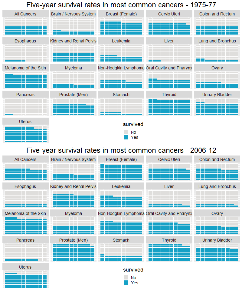
Now, to make the waffle plot I need my data in the tidy format. I will use gather function to bring together the year variables. Plot p1 will be for years 1975-77 and p2 is for the years 2006-12.
waffle_77 <- cancer %>% mutate(Y1977 = round(Y1977, 0), Y2012=round(Y2012,0))
waffle_77 <- waffle_77 %>% mutate(Yes = Y1977)
waffle_77 <- waffle_77 %>% mutate(No = 100-Yes)
waffle_77 <- waffle_77[ ,c(1,6,7)]
# Gather the values
waffle_tall <- waffle_77 %>% gather(survived, n, -type)
waffle_tall
## # A tibble: 42 x 3
## type survived n
## <chr> <chr> <dbl>
## 1 All Cancers Yes 50
## 2 Oral Cavity and Pharynx Yes 52
## 3 Esophagus Yes 5
## 4 Stomach Yes 15
## 5 Colon and Rectum Yes 50
## 6 Liver Yes 3
## 7 Pancreas Yes 2
## 8 Lung and Bronchus Yes 12
## 9 Melanoma of the Skin Yes 82
## 10 Urinary Bladder Yes 72
## # ... with 32 more rows# Final 1
# cancer Survival rates in 20 most common cancers
p1 <- waffle_tall %>%
ggplot(aes(fill=survived, values=n)) +
geom_waffle(color = "white",
size = .25,
n_rows = 10,
flip = TRUE) + facet_wrap(~type, nrow = 5, strip.position = "top") +
theme( plot.title = element_text(size=24, color= "black", hjust=0.5),
legend.position = c(0.55,0.1),
text = element_text(size=18),
axis.text.x =element_blank(),
axis.title.x = element_blank(),
axis.text.y=element_blank(),
axis.ticks= element_blank()) +
scale_fill_manual(values = c("#dfdedc","#16a1c6")) +
labs(title = "Five-year survival rates in most common cancers - 1975-77")waffle_12 <- cancer %>% mutate(Y2012 = round(Y2012, 0), Yes=round(Y2012,0))
waffle_12 <- waffle_12 %>% mutate(Yes =Y2012)
waffle_12 <- waffle_12 %>% mutate(No = 100-Y2012)
waffle_12 <- waffle_12[ ,c(1,6,7)]
# Gather the values
waffle_tall_12 <- waffle_12 %>% gather(survived, n, -type)
waffle_tall_12## # A tibble: 42 x 3
## type survived n
## <chr> <chr> <dbl>
## 1 All Cancers Yes 66
## 2 Oral Cavity and Pharynx Yes 67
## 3 Esophagus Yes 20
## 4 Stomach Yes 31
## 5 Colon and Rectum Yes 66
## 6 Liver Yes 18
## 7 Pancreas Yes 8
## 8 Lung and Bronchus Yes 19
## 9 Melanoma of the Skin Yes 93
## 10 Urinary Bladder Yes 78
## # ... with 32 more rows# Final 1
# Cancer survival rates in 20 most common cancers
p2 <- waffle_tall_12 %>%
ggplot(aes(fill=survived, values=n)) +
geom_waffle(color = "white",
size = .25,
n_rows = 10,
flip = TRUE) + facet_wrap(~type, nrow = 5, strip.position = "top") +
theme( plot.title = element_text(size=24, color= "black", hjust=0.5),
legend.position = c(0.55,0.1),
text = element_text(size=18),
axis.text.x =element_blank(),
axis.title.x = element_blank(),
axis.text.y=element_blank(),
axis.ticks= element_blank()) +
scale_fill_manual(values = c("#dfdedc","#16a1c6")) +
labs(title = "Five-year survival rates in most common cancers - 2006-12")To animate my graphs I will use R package “animation” created by Yihui Xie.
For more information you can read the original paper published in the Journal of Statistical Software here: An R Package for Creating Animations and Demonstrating Statistical Methods.
You can install from CRAN, or the development version from GitHub:
install.packages("animation")
# or development version
# devtools::install_github('yihui/animation')
Animate waffle plots (years 1975-77 and 2006-2012)
p <- list(p1,p2)

saveGIF({
    for(i in 1:2) plot(p[[i]])
},movie.name = "survival.gif", interval = 0.25, nmax = 30,
ani.width = 800)
## Output at: survival.gif## [1] TRUE
Apply ggdark theme
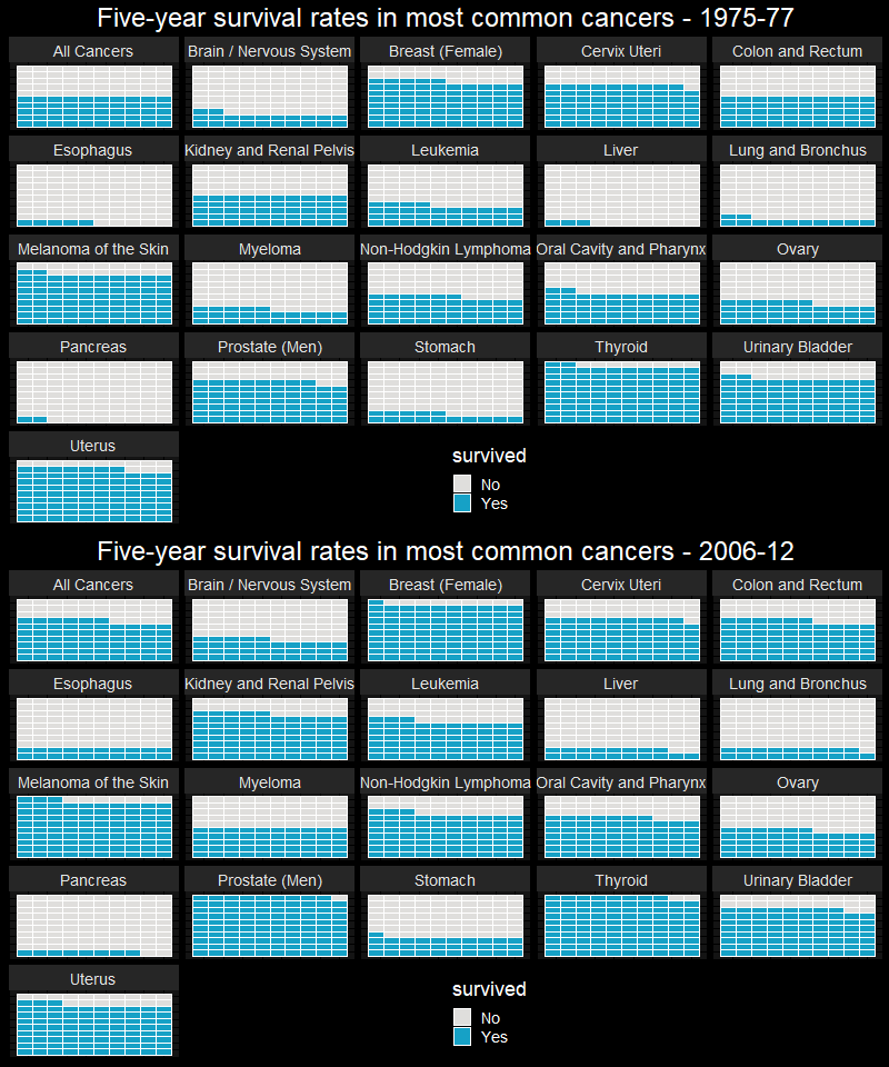
I will use ggdark package to apply a dark theme. This package contains a couple of beautiful themes. p1 will be for years 1975-77 and p2 is for the years 2006-12.
# Final 1
# cancer Survival rates in 20 most common cancers
p1 <- waffle_tall %>%
  filter(survived %in% c("Yes", "No")) %>% ggplot(aes(fill=survived, values=n)) +
  geom_waffle(color = "white",
              size = .25,
              n_rows = 10,
              flip = TRUE) + facet_wrap(~type, nrow = 5, strip.position = "top") + dark_theme_gray() +
  theme( plot.title = element_text(size=24, color= "white", hjust=0.5),
        legend.position = c(0.55,0.1),
        text = element_text(size=18),
         axis.text.x =element_blank(),
      axis.title.x = element_blank(),
      axis.text.y=element_blank(),
      axis.ticks= element_blank()) +
      scale_fill_manual(values = c("#dfdedc","#16a1c6")) +
      labs(title = "Five-year survival rates in most common cancers - 1975-77")
# Final 1
# cancer Survival rates in 20 most common cancers
p2 <- waffle_tall_12 %>%
filter(survived %in% c("Yes", "No")) %>% ggplot(aes(fill=survived, values=n)) +
geom_waffle(color = "white",
size = .25,
n_rows = 10,
flip = TRUE) + facet_wrap(~type, nrow = 5, strip.position = "top") + dark_theme_gray() +
theme( plot.title = element_text(size=24, color= "white", hjust=0.5),
legend.position = c(0.55,0.1),
text = element_text(size=18),
axis.text.x =element_blank(),
axis.title.x = element_blank(),
axis.text.y=element_blank(),
axis.ticks= element_blank()) +
scale_fill_manual(values = c("#dfdedc","#16a1c6")) +
labs(title = "Five-year survival rates in most common cancers - 2006-12")p <- list(p1,p2)
saveGIF({
for(i in 1:2) plot(p[[i]])
},movie.name = "survival_black.gif", interval = 0.25, nmax = 30,
ani.width = 800)## Output at: survival_black.gif## [1] TRUE
Future thoughts / Conclusions
Here, I made two different charts, lolipop and waffle plots by using ggplot2 and animated them with the ‘Animation’ R package.
Creating visuals to have a good overview of data helps to understand it better and helps us to think about future directions.
In some type of cancers such as lung and pancreas survival rates remained very low. How can we make it better?
Please comment below what do you think. What are the emerging data science applications / AI in healthcare?
Until next time!
Serdar